Introduction
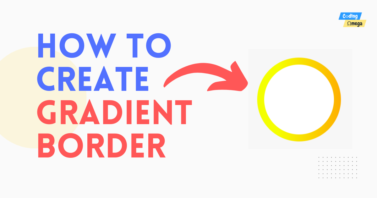
In this tutorial, we will learn how to make a beautiful border with a gradient effect and rounded corners using HTML and CSS. The steps we'll follow are easy to understand, and the final design will impress the visitors to your website. By following along, you'll get better at positioning elements on a web page, adding gradients for a smooth color transition, and giving borders rounded edges. It's a great way to improve your web development skills. Let's begin and have some fun being creative!
Source Code
Create two files index.html and style.css. Now add the code below in the files.
HTML
<!DOCTYPE html>
<html lang="en">
  <head>
    <meta name="viewport" content="width=device-width, initial-scale=1.0" />
    <title>Gradient Border with HTML CSS</title>
    <!-- Link the css file -->
    <link rel="stylesheet" href="style.css" />
  </head>
  <body>
    <div class="gradient"></div>
  </body>
</html>
CSS
.gradient {
  height: 200px;
  width: 200px;
  background-color: white;

  position: absolute;
  top: 0;
  bottom: 0;
  left: 0;
  right: 0;

  border-radius: 50%;
  margin: auto;
}
.gradient:before {
  content: "";

  height: 120%;
  width: 120%;

  background-image: -webkit-linear-gradient(to right, yellow, orange);
  background-image: linear-gradient(to right, yellow, orange);

  position: absolute;
  left: -10%;
  top: -10%;
  z-index: -1;

  border-radius: 50%;
}
Conclusion
Congratulations! You have learned to create a gradient border using HTML and CSS. Feel free to customize the dimensions, colors, and gradients to suit your specific needs. With this newfound knowledge, you can now apply circular gradient boxes in various web design projects, adding a touch of elegance and modernity to your creations.
web development source code gradient border